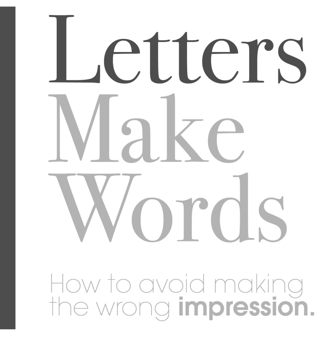
About Typography.
If you’re going to put text into anything, you should consider learning some of the industry’s best practices.
There are many ways you can leverage the style and size of any type arrangement in order to perfectly tell your story.
All typefaces or letter forms have a style, shape and even time period usage. There are a lot of clever ways to mix and pair typeface families in order to arrive at the mixture and style that best suits your business goals. In the professional world, if you’d like your potential customer to take you seriously, you must match the industry standards of good typographic practices. If you’re not sure what I mean by “Industry Standards” then you need to spend a moment the next time you’re shopping ANYWHERE and notice all the packaging and branding you’re surrounded by. Which ones make you feel the way you want your customers to feel? Take notes, and search for similar examples elsewhere. There is nothing new under the sun, only new ways these things can be combined and made unique.
In a more casual tone here…I’ve taken a few moments to spell out some of the real obvious mistakes that many business professionals make.
These errors can be remedied with a re-brand, or a slap in the back of the head.
Typography 101:
- Comic Sans is not a usable typeface. Ever.
- Edwardian Script is no longer suitable for headlines. It’s overused and impossible to read at a quick glance.
I know you want the letters to look glorious. But this script has to go back to the archive from whence it came.
There is a place for scripts. And only the thoughtful typographer can find that place.
If you want something killer, go to www.dafont.com and search some of their free fonts. You’re welcome. - Times New Roman is not your logo font. Pick a real font. This is good for college thesis papers, and nonsense you don’t care about. It’s classic, yes. But it demonstrates to the trained eye that you really don’t know anything about presentation. There are very rare exceptions. Such as when you’re on the web and you have no other choices. Google fonts has the master library of what can be leveraged online.
- WRITING YOUR BODY COPY IN ALL CAPS MAKES IT READ LIKE YOU’RE SHOUTING. (Whew.) Proper use of Letter Case is imperative. The point of using words is to help a person read them and to learn the information within—don’t make it harder for them. Contrasting shapes are easier to read, upper and lowercase letters mixed together allow for easier reading. I didn’t make it up. The eyes need variation and empty space in order to digest what they are trained to read. The hard corners and non-existent letter height variations make it a challenge to absorb. Good for a logo, or one, two, or three words. Bad for most other uses.
- Single letters R not acceptable for professional stories. Spell the word out and use it correctly.
Well-schooled individuals are not going to be impressed at how you can bring your texting skills to the narrative. - Font Colors. Yellow on white is not an option. Pick colors that match your vibe. Explore and get ideas from interior design catalogs or go check out the color boards on Pinterest.
- Apply Font Size Hierarchy. If all the fonts are the same size, it’s a mess to read. If you want to control the way it will be read, put only the most important words in a large font. Slogans are best short and big. Next size down for the headlines and then keep going smaller for body copy and legal disclaimers at the bottom.
- Make sure you tell a story with your typography. Don’t use fonts that don’t relate to your story, and make sure you hired a qualified writer to give your story a voice and flow. If you’re not much of a writer, hire one. Seriously. When judgment is cast, you don’t want your lack or grammar skills to be your defining trait.
- Putting your text over an image is cool, but only if the text can be read. Find an empty space in the image or put a box behind it. Transparent boxes are in right now, and can look awesome. Go at least 80-90% darkness. This way you can see that there is a background behind it, but you can easily read the text.
There is always more. This is just a quick off-the-top-of-my-head list.