What you see on screen is not what you get on paper.
When trying to take your masterful design from the digital proof to the tangible printed piece, you must consider how the ink will hit the paper. Paper type, color choice, and trapping one color to another are among the many things to consider.
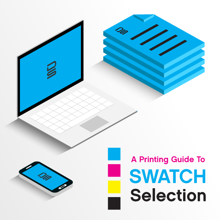
As someone who does a lot of print design work, I’m no stranger to preparing my work to go to print. With many rounds of communication with the printing vendor often taking place, it’s important to note that the equipment operators are often totally separate from those of us in the designer’s chair. A good print tech is usually very specific when it comes to how they want to receive files. To save headaches and expedite the printing process itself, it’s important that you know how to select the right color codes for your files.
There are a few types of color formats to deal with when building a file and then exporting it to press.
- PMS Swatches.
If you know what you’re doing when you brand a client, you will know that when the logo gets a color palette, it also gets matching Pantone© swatches to accompany each swatch. This can be hard to do, because it often involves a color swatch book, and then a trial-and-error exploration of swatches until you find one that is just right. For a quick resource that you can share with a client, check out this link: http://www.cal-print.com/InkColorChart.htm. It’s a very nice all-in-one showcase with a very robust library of Pantone© Color swatches.
When selecting colors for whatever you’re doing, it’s ideal to consider how they will print. What you see on screen is not exactly the same as what you see on paper. Get a color swatch book, and use it as often as possible. Don’t guess, and as a result you’ll get exactly what you see in your book.
2. CMYK Swatches.
When a printer calls a piece “Four Color” or “4C,” they mean it does not have Pantone© number codes. Instead, its color values are selected using what is called “CMYK.” This is an acronym for “Cyan, Magenta, Yellow, Black.” In Photoshop, Illustrator, and InDesign, you’ll find the CMYK swatch mixer to be very easy to manage, as it allows a user to mix colors by eye or by percentages of 100. With most online printing houses, they want the colors in CMYK. Still, what you see on screen and what will print are not always going to match. Assume that the print will be 10-15% darker or lighter, depending on the print shop. CMYK is the standard for printing anything in multi-color (more than 3-4 swatches and things with photographs), so learn how it works, and use it. If you follow the rules, your client will not be upset when they see the print vs. the digital proof, because they will be incredibly close in resemblance.
3. RGB Swatches.
RGB stands for “Red, Green, Blue,” and is mixed using light, not ink. So although you can get some awesome neon colors in most web graphics, you cannot get those tones into a normal print piece, because they will flatten and soften when converted by the printing vendor. All printing equipment will automatically convert RGB to CMYK, no matter what buttons you press. Again, it has to do with the ink spectrum vs. the light spectrum. It’s okay to work in RGB if you’re designing strictly for the web—in fact, it’s advised. But you should toggle the color setting options to CMYK or Pantone© if you plan to put the work to paper.
4. Hexadecimal aka “Hex” Code – Web Swatches.
Another standard way of selecting colors, but one that is only useful in the web environment. When working with CSS styling code, you should learn how to use and find these codes. All color mixer palettes in PS, AI, INDD will show you a 6-digit hex code number that goes with whatever RGB/CMYK display values are chosen. You’ll know it’s right because it’s a 6-digit number, hence being called “Hex.” You can get some awesome color mixes with this formula, however they are not going to be accurate if you want to turn your project into a printed piece. It’s best to fall back on the CMYK values and/or select the right PMS color swatches.
Let us handle it for you.
We manage and export all our files with the highest precision and our print production services are second to none.
Contact our print design experts to take your idea from concept to design to print.