10 Reasons Why Your Website Should be Re-Developed with Mobile-Ready a.k.a Responsive Website Code.
It’s no secret, everyone you see is on their smart phone. The new phone models feature large and lightweight displays that are like having a personal pocket-sized window to browse the entire world wide web. From reading our emails, responding to messages, and endlessly researching all sorts of websites, it’s no secret that these little devices have changed our lives forever.
If you’re a business owner hoping to impress and build your customer base through your company’s website, you ought to take some notes from the list below, and make sure you’ve got a plan of action for getting your site ready to roll on mobile.
There are a few buzz words you need to remember, and a few important ideas that you need to understand before delving in too deep.
The primary buzz word you’ll want to understand is the word “Responsive”… this means that your website code can read which device a user is visiting the site files from, and then display the proper version, and layout of the content, based on that device’s screen size. When a site is written with “Responsive Code” it is considered a “Mobile-Friendly” website. The markers with in the code will tell the web browsers like google.com to mark your site display as “Mobile-Friendly” and in turn, comply with their 2015 ruling to flag and un-feature those sites that are “Not-Mobile-Friendly” sites.
1. Everyone is on Mobile.
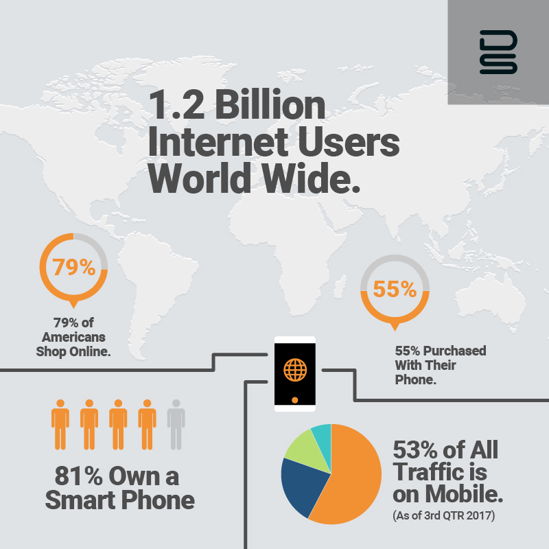
There are an estimated 1.2 billion people on the internet world wide. 81% of them are Smart phone users!
2. More than half of all web traffic is mobile.
This number keeps growing each year. More than 50% of the traffic online right now, is from a Smart phone.
3. Mobile users behave differently, than desktop users.
Say good by to the mouse, and hello to fingertips and thumbs. There must be buttons and features that are usable by the modern smart phone user.
Make it easy for those big thumbed, near sighted, uncertain users who need their hand held on their hand-held… see what I just did right there.
4. Mobile users buy more.
Statistics show that Smart phone and tablet users are buying everyday products and services at a much higher rate than desktop users.
This must be because of the accessibility, and the way we all use our phones more on personal time. #couchsurfingchampion
5. Mobile users switch screens more often.
If your site is not working on the phone, you’re gone. The speed of changing screens, apps, and tabs is something we have to admit we do when on a phone.
If you give a poor UX ( user experience ) you have lost the user. Happy users = satisfied customers.
6. Mobile landing pages require different strategies.
Don’t make people read too much, or make it impossible for them to find the way through. Give them short and sweet headlines, beautiful web optimized images, and a big call to action button. Give me a button to push please!
7. Google no longer loves you.
If you are not using mobile-ready aka “Responsive Code” you are not going to be displayed. Their new search algorithm degrades the rank and display of any site that is not mobile-ready. If your site is still the “Pinch-n-Zoom” kind of site, usually still done in just HTML, and probably at least 5 years old, you are not going to be displayed. If there is a more relevent result with a mobile-ready platform, they will display them first. And even go as far as to label your site results as non-mobile-friendly. Google is calling the shots, and resistance is futile. Get on board, and don’t get left behind.
8. Social Media referrals are on mobile.
91% of mobile usage is for social activities. When folks are clicking through on social, most of them are on a hand held device.
Again, if you’re still displaying your 5 year old HTML only site, you lose again.
9. Great Mobile sites make your brand stand out.
Only 56% of small businesses have a mobile site. But nearly all of the big brands have made the investment. If you’re not in that percentage, you need to circle back and get started on your website redesign. When a site is easy to use, and has a clean and simple interface, we are not only pumped to click through, we are also eager to share how great the experience was. Great experiences get great reviews.
10. Smart phone users have the web with them everywhere they go.
It’s no joke, people have their devices protected, personalized, and in their pocket at all times.
If you don’t see this trend and know that it’s here to stay, you need to wake up. The future of the web is in the device folks have on them at all times.
Free Advice…
Plan your website re-coding project with a capable development house and get started with your redesign. It can take a fair amount of time to reorganize your thoughts, but it’s worth the effort to get current with your website design presentation. Best face forward.
You will be judged negatively for your poor performance if your site sucks.
Where to start?
We can help and we’d love to connect and organize your thoughts. With a custom built website that’s authored using Responsive code, you can totally forget the list above knowing that you’ve got you covered. DiGuiseppi Studios has a standard of high quality web development deliverables, with a focus on high end and high efficiency.
Stay tuned for more insights, and ideas on what else your company could be doing to keep up and maybe even out shine against the best in your industry.